Mobile devices are ruling the internet! There has been a high number of mobile device visitors these past 4 years. With this high mobile device use, there has been an increase in online sales and daily views per site.
Cross Browser Testing. Cross browser testing should always be conducting after finishing a website design. Testing a website on different browsers will ensure that the website design and performance works the same on all different browsers. When designing in CSS or coding in Javascript, there are certain codes that must be added so a website is compatible with older browsers like internet explorer and firefox.
UI or UX Animation. Tell a digital story! With abundant room for creativity, the one-page design has room for a UI/UX coded animation. These forms of web animations will often bring an element of engagement with a first-time web visitor and often result to the visitor staying longer on the web page.
One Page Web Design. The one-page design has introduced a new form of design to the internet. This is truly the best layout for a mobile device visitor. The one-page design moves in a vertical motion and navigates in top to bottom movement within its own page. This type of vertical layout that includes everything on one page makes it easier for a mobile device visitor to navigate around the site. The one-page design brings advancement and room for creativity to web design.
Increase Font and Button Size. Start to increase the web font sizes by double and triple the size! In order to satisfy a mobile device visitor, a web site must have readable text. By increasing the web font size, a website is much more mobile friendly and readable. Buttons should also be increased in size to be easier to click on mobile devices.
Example of a Viewport tag: <meta name=“viewport” content=“initial-scale=1”> The above is the common viewport tag that should be added to the head section of every web page. Defining a Viewport tag fixed width: <meta name="viewport" content="width=500, initial-scale=1"> The above shows how to set a fixed width with the viewport tag for a mobile device.
2-The Viewport Tag. The viewport tag notifies mobile devices that a website must not go to its defaults standards, but convert to mobile standards. With this tag, a website will instantly be mobile friendly.
Mobile web design has become one of the modern web design standards to look out for! Google has introduced mobile friendly web design standards due to the high use of mobile devices. There are billions of people around the world that browse the net through a mobile device daily. Mobile devices have made it much accessible for the average person to browse the net on the go.
Finding that top number 1 web design company can do wonders for your company. What every company needs? An online profile. http://www.ntwdesigns.com/ What your online profile needs? A domain link to have people find you. What your domain needs? A good website to showcase your companies assets. Who can create this kind of website for you? Only an experienced web design company.
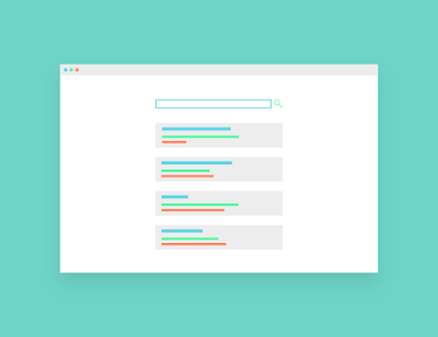
Minimal Elements. Minimal design is very popular and complimentary to mobile web design. By having minimal elements on a website, it will ensure that the page will be much more lightweight and fast loading on all devices. Minimal design brings simplicity and sharp focus at the same time.